Mr. Meow's Kitchen


Overview

Two teams of two players race to complete pies faster than their opponents. Players wear chef hats fitted with motion-capture markers that track their position in a physical kitchen space. Real cooking stations—complete with Arduino-powered cutting boards, frying pans, and ovens—translate physical actions into in-game progress. The goal: total immersion, where the line between physical and digital cooking blurs.
My Role: UX/UI Designer & Project Manager
Applications Used:


MY Team
Ella
UX / UI / Project Manager
Sloane
Art Director / Graphic Design / Texture Artist
Crystal
2D Art / Animation
Patrice
3D Art / Animation
Helena
Software / Motion Capture
Sandhya
Fabrication
Sebastian
Hardware / Electrical Engineer
Will
Music / Sound
Game loop
Our first challenge was creating a game loop that made sense and was engaging for players. We wanted to gamify an experience that people did in their everyday lives. We also wanted to explore what exactly it would look like to bring a game to life, literally.
We established the basic foundations of a cooking game: complete mini game-like tasks to create a recipe. From there we had to refine these mini game ideas as well as figure out how exactly we would be able to complete the tasks in real life while having direct feedback on the screen
Original Unknowns
Two Player:
-
How will both players interact with the kitchenette at the same time?
-
How long does the kitchenette need to be to comfortably fit both players?
-
Can only one person be at the kitchenette at a time? If so, what does the other player do?
Cooking Mini Games:
-
How are we implementing the minigames through fabrication & Arduino
-
What cooking mini games are we using? Chopping, Frying, Baking?
-
What food items do we need? How will players receive/collect food items?
Basic Game Loop

A walk through of the game loop/ user experience. Through this I was trying to understand how we could structure the game to make the mini games engaging, while also give both players on a team something to do at all times.
I went into detail on exactly how many ingredients a player would need and how many times they should perform a mini game in order to complete it. I then sent this over to my team, so we all understood the basic flow of our game.

Playtest

After our first playtest we quickly realized we had to restructure a lot of our game
We wanted our game to be fast paced and stressful and that element was severely lacking. Players were also confused on what exactly they were supposed to do. We then had to find a way to explain the game to players, without completely giving away our whole game, as we wanted players to learn from their mistakes and figure it out as they go
Game Loop Refinements

Changes:
-
A player select & team select
-
The ability to complete multiple stations at the same time
-
Replace chopped ingredients with a bowl of chopped ingredients, that only needs to be deposited once
-
A recipe book, shown through the UI, that appears when the player walks up to a station empty handed
-
This book will show the player what ingredients belong at each station
-
-
Progress bars for the chopping and frying mini game now constantly decrease or “go down.” Players have to hit fast and hard to fill them up
-
There is now a dial UI instead of a bar for the oven to match the dial the player is turning
Restructured UI to Match Game Loop Changes


User Interface
Low Fidelity UI Mockup Design

Both players would not be able to see/play the game with our original UI idea (a rectangle that covered half of the screen during cooking minigames.) We had to shift directions and came up a small thought bubble pop up with a progress bar above it.
This way one player can view the minigame while the other player can still see the environment while they collect ingredients.

A low fidelity mockup of the UI done in Figma, designed over a screen shot of the game.
-
Created “thought bubbles” to hold 2D cooking animations so the player knows they have triggered the mini game
-
Created progress bars above the thought bubbles so players can see their progress as they complete each mini game
-
Created an “Ingredient pop up” that shows the players which ingredients they need for each cooking station
-
Created starts to show the player when they completed a cooking station. Every time the player completes a cooking station the star will fill
-
Created a timer to show the players how much time they have left
High Fidelity UI Design

Recipe book UI
shows the players the ingredients they need for each station.
Animated in and out of frame when players approach a cooking station with no ingredient.
Players must walk up to the counter to activate the recipe, this way it's not constantly on the screen
Recipe Book Progression


Thought Bubble & Progress Bar
Used for cooking mini games (chopping and frying)
Displays over the cooking station so players can still clearly see the rest of the screen
Thought Bubble Progression


Cooking Steps
Shows the steps in order to complete the recipe, only the player completes a step/station, the box surrounding the icon turns green. This UI replaced the stars from the low-fi concept. It's the same idea, but the icons are clearer to the player

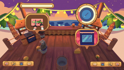
Dial
Originally, we had a bar for the oven mini game. However, players were confused as they were turning a dial to control the arrow. We decided to change the UI to a dial so it would match the exact movement the player is doing

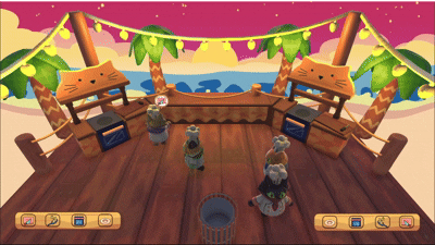
Aesthetic Design
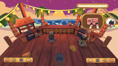
Moving into high fidelity, we knew what the general aesthetic of our game was: beach shack. We wanted the UI to reflect this, so we decided to go with a wood theme, matching the planks the players are moving on. For the colors, we wanted to use a light brown, to contrast against the dark wooden color used on the plank flooring and kitchenettes,


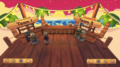
Team Select & Tutorial
We added basic UI for the team select & the tutorial. We didn't want a full tutorial as we want players to figure it out as they go. Instead, we opted for a quick animation showing all the steps the players need to complete in order to win.

Typography
We decided on Frodoka One as our type face, as its playful and easy to read. We don't have a lot of text in our game as most information is shown through icons, so for the text that is present we wanted it to be loud and bold. The pink outline around the text also gives in a pop of color and was well received by the players


Information Bubbles
During our playtest we accoutered 3 main issues that could easily be fixed with UI:
-
Players didn't know about the recipe book
-
Players didn't know when they already placed an ingredient in a station
-
Players didn't know whether or not they failed a mini game
In order to fix these problems, we made generic though bubbles to hold icons that give the player the information they need. We created a question mark to go over the recipe book, so players know to go their if they are confused. We created an X when a station is full. If a player tries to play another ingredient in a station when its full the X will pop up. Lastly, we created a bubble to hold the emotes, we have three different emotes that play depending on how well a player did on a mini game.
Reflection
Overall, I am really happy with how the UI and game loop turned out. It was challenging having to make UI that catered to two teams and four players. My team and I were constantly brainstorming on how to show information without covering large parts of the screen, as that would hinder other players. Working on the aesthetic design was also a challenge, our game's art style is very dynamic, mixing 2D and 3D art. Our UI also had to be dynamic while matching the overall style and feel of our game. If I had more time I would have loved to add more "juice" to the game. We wanted to add particle effects that complimented UI as well as street fighter-style text that displayed before a mini game started. I think the UI does a good job assisting the players, however I definitely could have explored more aesthetic styles if I had more time.