KidsConnect
Project Overview


The Problem
Most digital social platforms are designed with adults in mind, leaving kids to navigate spaces that are not age-appropriate, safe, or developmentally supportive. When access to these platforms is restricted, curiosity often increases, pushing kids to explore them anyway, frequently without the tools or guidance to do so safely.
While some kid-focused platforms exist, they tend to address only fragments of the problem, offering limited social interaction, creativity, or engagement, and often excluding meaningful parental involvement. As a result, kids lack a digital space that allows them to genuinely connect, play, and express themselves online in a way that feels both fun and safe.
This creates a gap for a thoughtfully designed platform that balances kids’ desire for autonomy and self-expression with parents’ need for visibility, trust, and reassurance.
As UX designers we were tasked to create a safe, social, online space for children ages 6 - 12 for our class project. Along side designing the app, we had the opportunity to conduct user research and interview both kids and parents ensuring that our app design was both functional and solved the problem: kids online safety.
Role
UX Designer
UX Researcher
Duration
4 months
Tools


The Solution
This project proposes a safe, age-appropriate digital platform designed specifically for kids to connect with one another online. The platform allows children to socialize, play games, and express their identities through customizable avatars, while staying within an environment built for their developmental needs.
To encourage healthy habits beyond the screen, kids can earn in-app rewards through real-world activities, with progress monitored and approved by parents. Built-in safety and transparency features give parents visibility into their child’s activity, helping create a space that feels engaging for kids and trustworthy for families.
Process Overview
1
2
3
4
5
Empathize
Define
Ideate
Design
Reflection
Initial Research
Children today are introduced to the internet at increasingly younger ages. According to recent studies, over 70% of children under 12 regularly use online platforms for entertainment and communication. In addition, these children may face many mental health problems from being online like anxiety, stress, or sadness over time (Yale Medicine, 2023).
Many of these platforms are not designed with child safety in mind. Unlike older platforms such as Club Penguin or Webkinz, which created moderated, age-appropriate spaces, today’s options either lack sufficient safety measures or limit creativity and social interaction.
Children may face many mental health problems from being online like anxiety, stress, or sadness over time (Yale Medicine, 2023)
15.6% of kids had experienced some sort of online child sexual abuse, 5.6% reported that they experienced grooming online (PubMed Central, 2022)
“22% of eight to 17-year-olds lie that they are 18” (McMahon et al., 2024)
Competitive Analysis
Each team member analyzed a competing platform to better understand how children interact with existing digital spaces, the benefits these platforms offer, and the potential risks they pose. For my analysis, I focused on Roblox, one of the most popular gaming platforms for children, to examine how kids engage with the site, its impact on young users, and the safety features currently in place.
Roblox

-
Huge active community
-
User-generated content allows for lots of creativity
-
Social features include: chat, friends, multiplayer
Ziaazoo

-
All posts are screened for safety
-
Has educational and creative content
-
Requires a verification video from both the parents and kids
Minecraft

-
Promotes teamwork and collaboration
-
Can play offline
-
Used in classrooms for learning
Messenger Kids

-
Strong parental control and approval system
-
Designed fully for safety
-
Has screen time management
Just Talk Kids

-
No phone number required
-
Fun tools such as stickers, games, etc.
-
Parents can manage contacts and can block strangers for their kid
User Interviews
Interview Protocol
My group designed two interview protocols, one for children and one for parents, to gather insight for creating a safe and fun app for children. Our overall goal was to collect honest feedback to guide the app’s design, safety features, and user experience for both kids and parents.
Kids Interview
We focused on what apps they enjoy, how they interact with others online, what “safety” means to them and what features they’d like in a new app. The questions were simplified in order for the children to be able to answer easily.
Parents Interview
The questions were aimed to understands the parents concerns, expectations, and safety preferences for their child’s online activities. We refined the questions to better distinguish between gaming and social media topics and to make each question’s purpose clear.

Phase 2: Define
Digesting the Data
After conducting the interviews, we focused on finding ways to make the insights easier to organize and understand.
We synthesized all of our user research into an affinity diagram and a user persona to better identify patterns and key insights. Bringing all of the data into a single space allowed us to group related findings and distill them into clear, concise themes. This analysis helped ground our design ideation and made our brainstorming process more focused and effective.
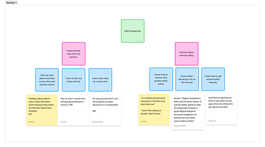
Affinity Mapping

After conducting our affinity mapping session, we landed with three major themes: kids perspectives, parental concerns, and app ideas.


Stakeholder Map
After gaining a clear understanding of our users’ needs, we shifted focus to the people, roles, and relationships that influence the ecosystem of our app. To visualize these connections, we created a stakeholder map that helped identify key participants and clarify how they relate to one another.

Roles of the Stakeholders
Primary Users
Kids (6–12): main users who seek fun and safety.
Teens / Alumni: older users who may want to stay on the app.
Secondary Users
Parents: approve, monitor, and guide use.
Educators / Schools: encourage balanced digital habits.
Healthcare Professionals: advise on screen time and well-being
Tech Stakeholders
Developers & Designers → build and maintain the app.
AI Moderation → monitor content and alert parents.
App Stores → distribute app, handle payments.
Investors → fund and support growth.
Legal and Safety Stakeholders
Regulators → enforce laws (COPPA, GDPR).
Child Safety Orgs → set safety standards.
Law Enforcement → respond to abuse reports.
Privacy Advocates → protect data and rights.
Other
Commercial Partners & Advertisers → fund and promote.
Media & Journalists → shape reputation.
Competitors → influence trends and user expectations
User Personas
Creating multiple user personas allows researchers to approach the design problem from a broader perspective. By considering different needs, motivations, and concerns, the product can be designed with greater accessibility and feasibility, ultimately supporting a wider range of users.
Our first persona represents a 10-year-old boy who enjoys playing video games but is hesitant to interact with strangers online. Our second persona is a 47-year-old mother who prioritizes her children’s online safety and wants greater transparency and honesty around their digital activity.


Phase 3: Ideate
Design Process
With our ideas defined, we transitioned into sketches and a digital design space. Through brainstorming, we explored a wide range of concepts, then prioritized key features to establish the core user flow. This process informed our initial designs and ultimately guided the development of our final deliverables.

Each group member sketched 20 feature ideas informed by insights from our user interviews and affinity mapping. We then evaluated and mapped these ideas along two key dimensions, child enjoyment and safety, to help prioritize features that best balanced engagement with parental trust.

Priorities
Our group then came to an agreement on which features were the most impactful to our solution. These would be the design we focused on first when creating our low-fidelity wireframes.
Low Value
-
Item shop
-
Badge reward system
-
filters and other video customization
-
Instant messaging system
-
Games sent through messages
-
To-do list
Mid Value
High Value
-
Parental safety features
-
gamification
-
short form videos
-
Avatar usability and customization
User Flow
We then each selected a feature from our high and mid priority values to begin low-fidelity prototyping. I was in charge of the parental safety features and short form videos which integrated with our home page and the avatar creation/customization feature.

Low-Fidelity Wireframe
Once the core features were defined and the user flow was established, I began translating these ideas into low-fidelity wireframes. These early designs focused on structure and usability, ensuring that each feature connected intuitively within the overall experience.
My design decisions were informed by competitor design systems and familiar interaction patterns from popular social media platforms such as TikTok and Instagram, helping create an interface that felt approachable and intuitive for users.
Key Screens & Features
-
Home Page
-
Feed of short-form videos created by friends
-
To-do list tied to real-world activities
-
Featured games
-
-
Safety Features
-
User profile with separate child and parent views
-
Parental oversight and activity visibility
-
-
Avatar Creation
-
Customize and edit avatar features
-
Update avatars regularly
-
Earn new items through the in-app shop
-

Phase 4: Design
Design Concept
Our main priorities when creating our high fidelity prototype were functionality, growing, and familiarity
Functionality
We wanted our design to be clean and distraction-free, allowing crucial safety features to function seamlessly without confusing the child user.
Growing
Our design aims to be timeless and adaptable. I would say it’s friendly enough for a 6 year old but not so childish that a 12 year old would abandon it. This allows the app to grow with the child!
Familiarity
Our design draws inspiration from popular children’s platforms like Roblox, as well as widely used social media apps such as TikTok. While the platform is designed specifically for kids, we were intentional about avoiding an experience that felt overly simplified or “dumbed down.” Instead, we aimed to create an interface that feels familiar and engaging, similar to the platforms kids already enjoy, while thoughtfully integrating safety features in a way that feels natural rather than intrusive.
Design System
Color Palette
Fonts

We selected blue and purple as our primary colors to convey trust, loyalty, and reliability, key qualities for a platform designed around child safety and parental confidence.
Orange was chosen as a secondary accent color to provide contrast and energy. Positioned opposite blue on the color wheel, it adds a sense of fun and excitement, helping the interface feel playful and engaging for kids.
High-Fidelity Wireframes
Below are the primary high-fidelity frames I designed, including the home page, user profile, avatar customization, and in-app shop. These screens demonstrate how I incorporated feedback from our user testing sessions while consistently applying the established design system. All artwork used in this prototype is AI-generated and intended for prototyping purposes only, not for the final product.

Phase 5: Reflection
Reflection
As a team, this project taught us how much thought goes into creating a digital space that is both fun for kids and safe for parents. Throughout the process, from interviews, to sketches, to user testing, we learned how differently children and adults approach technology and how important it is to design with both perspectives.
Seeing users interact with our prototypes helped us understand where the app felt confusing, which led us to make clearer labels, more intuitive icons, and more engaging visuals. Our research and interviews highlighted major concerns like safety, privacy and clean communicating. Overall, the project gave us a deeper understanding for user-centered design, and how intentional choices like color palettes to icon clarity to task flow can directly impact how confident and safe children feel when using a platform.